Agency: The BIO Agency
Art Direction: Marcus Dunford
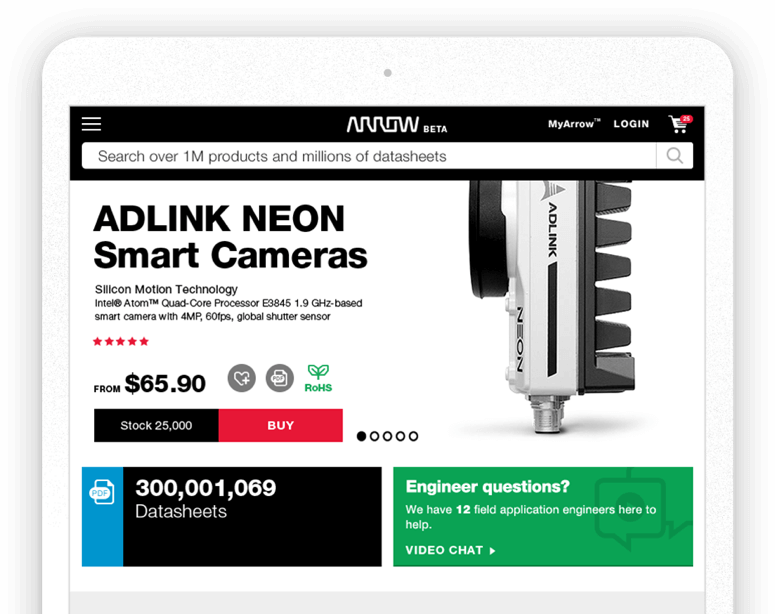
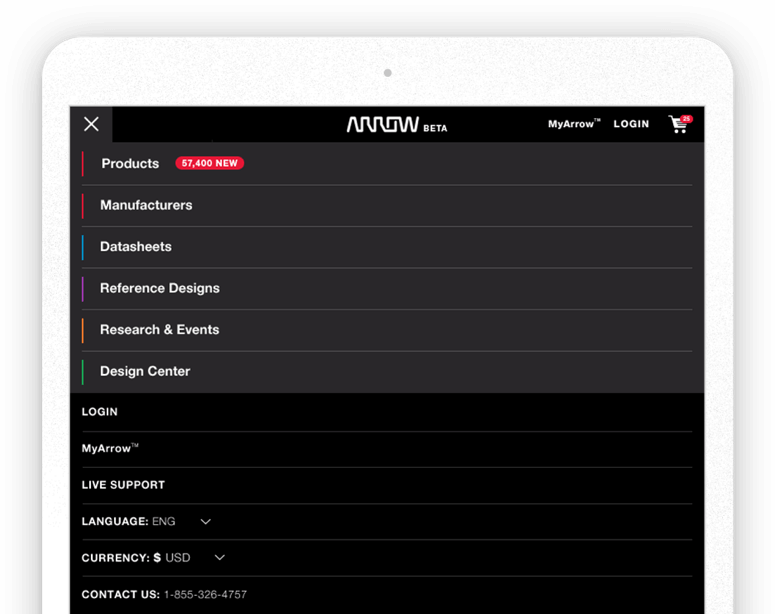
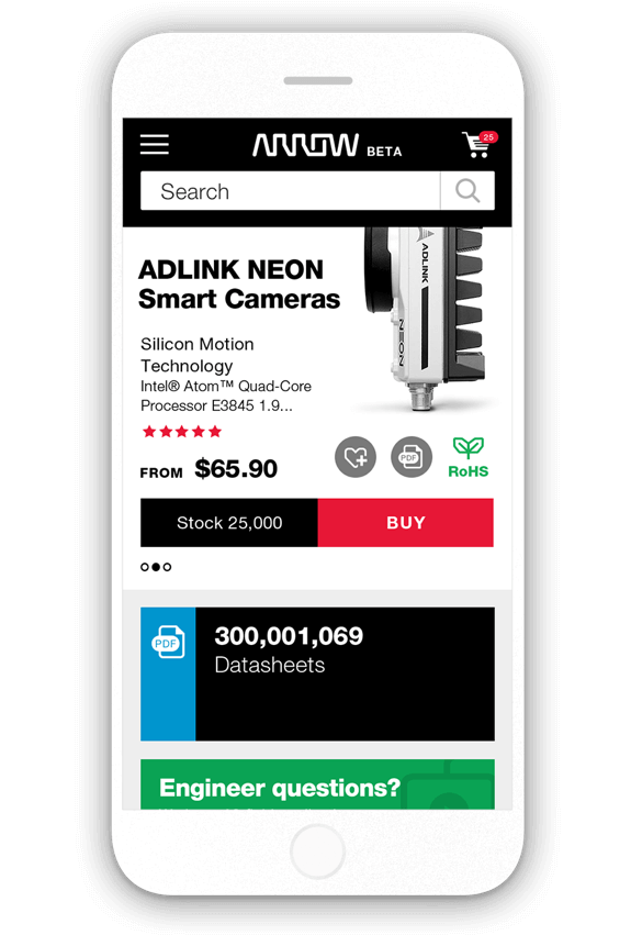
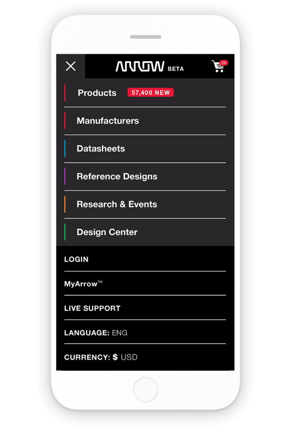
As I’m currently one of only a few designers working on Arrow, I’ve been able to have more ownership over the work for this client, and have been able to iron out a lot of the issues in Phase I. The first of these improvements addressed the header, decreasing its vertical height and repositioning and resizing elements based on user-testing and engineer feedback.
Desktop
Modular structure


Dealing with content


1. Decreased the logo to give it its intended clear space
2. Corrected the hierarchy between the search & categories
3. Increased the focus on accessibility via login
Tablet
Old Header
1. Header too large for tablet and was pushing content too low
2. Tests showed certain features were often unused in mobile devices
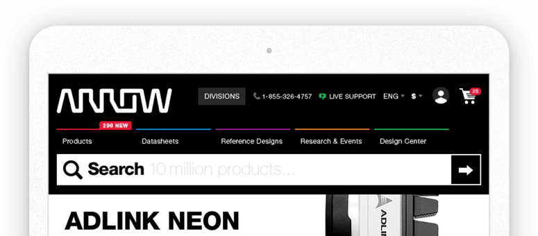

New Header
1. Condensed much of our information into a simple burger nav
2. Kept a quick access to login pages and cart visible at all times
Mobile
Old Header
1. Mobile navigation wasn't intuitive, with its side-scrolling feature
2. Cluttered visual made for an awkward hierarchy
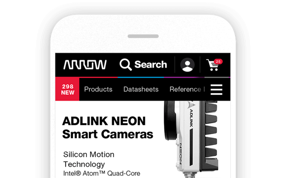

New Header
1. Condensed information into a simple burger nav, this time maintaining only the cart to save space
