
Swire Sustainability Report 2016

Project summary
Working with sustainable design agency Futerra alongside Hong Kong developers IR Asia, I was tasked with designing Swire Pacific's first online sustainability report. With a structured sitemap, I created two visual concepts with variations in navigation and style.
Based around the theme 'Past & Future’ I developed iconography inspired by knot diagrams and used details found on chartered maps as a nod to Swire’s maritime past and coupled with a clean, modern visual style looks to Swire's future sustainable endeavours.
The second concept focused on clear simple navigation with a vertical sidebar and blending pages seamlessly together creating the feeling of moving through the report as one unit. I’ve included it here as I really enjoyed the concept and it contained some interesting ways of dealing with data and motion.
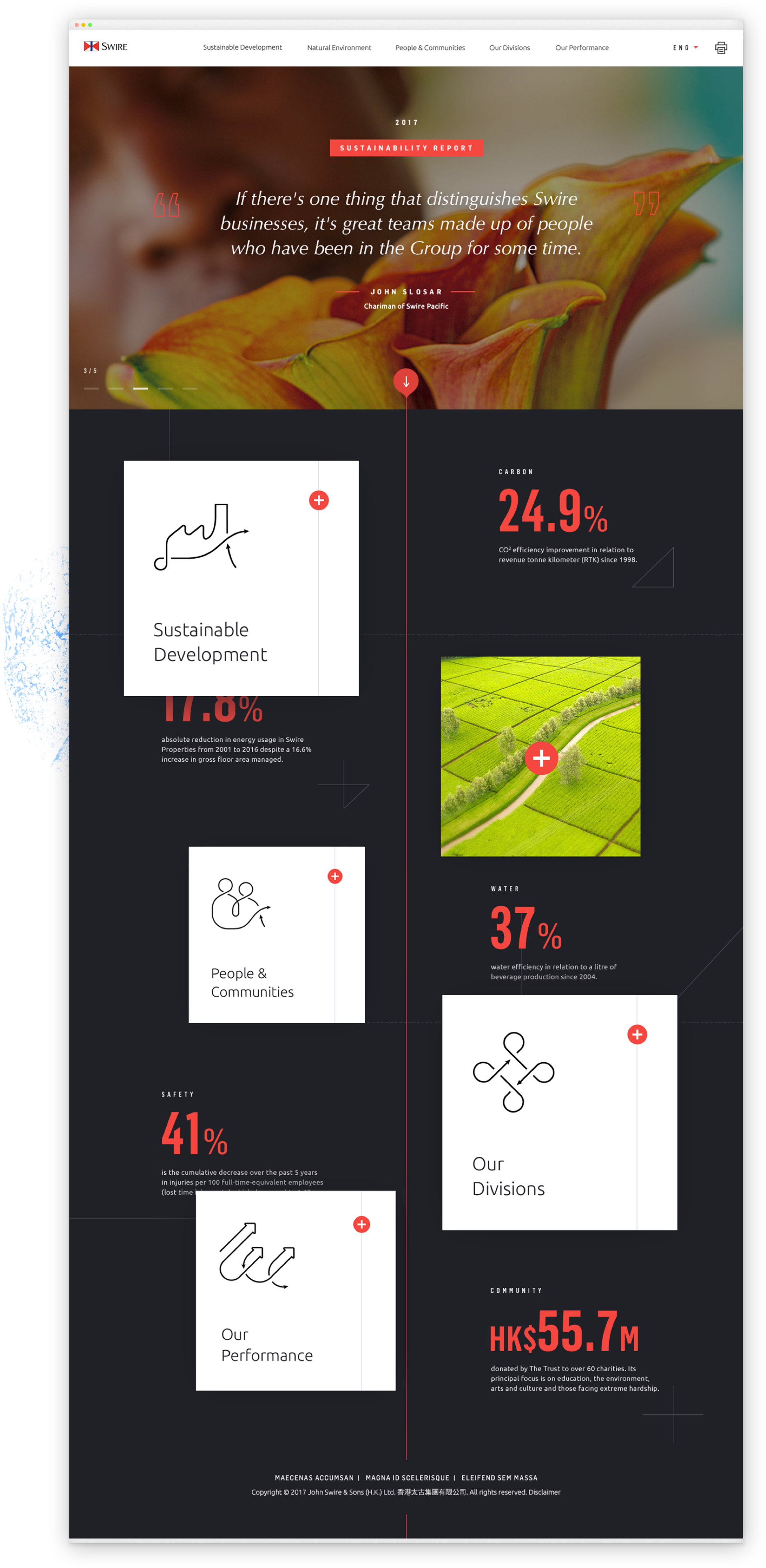
Homepage

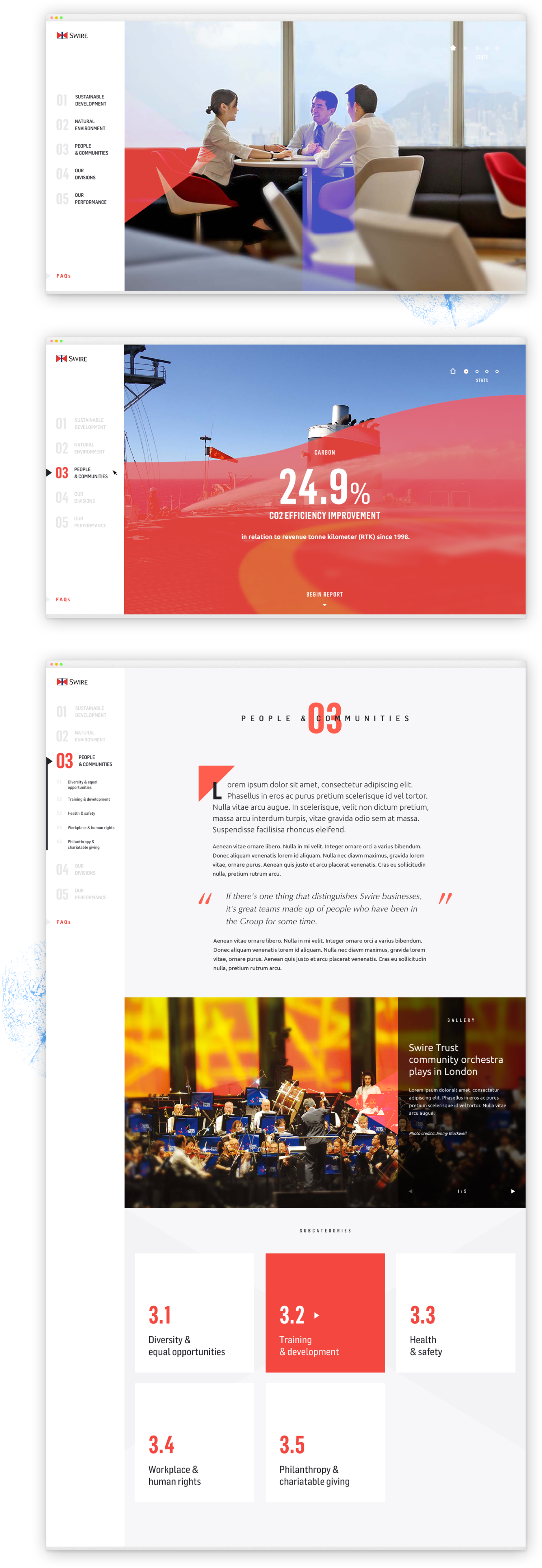
Desktop
The idea with this page was to use z-space to pull out the five core sections of the site whilst using the rear plane to show some key facts and achievements from the last year. You can also see some of the navigational markings in use to frame these and the section tiles contain custom nautical icons.
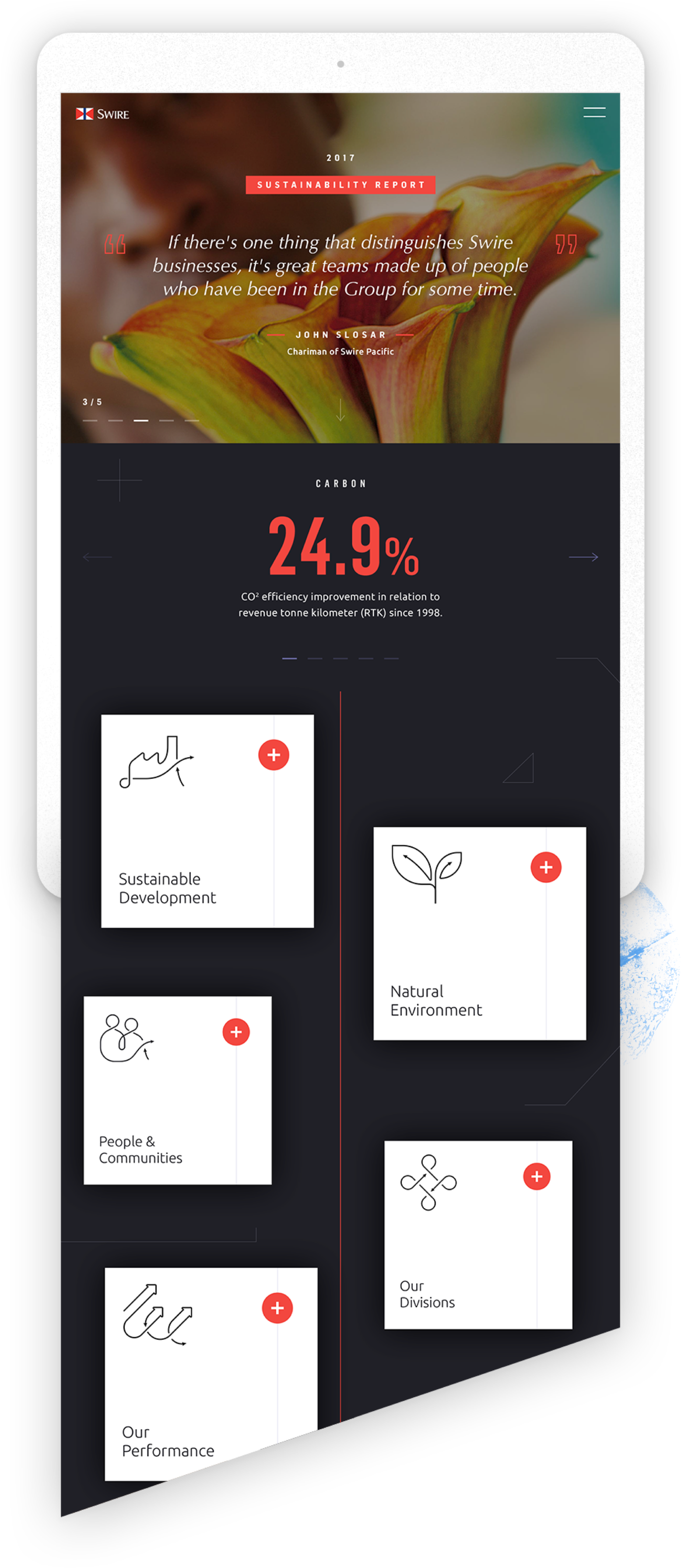
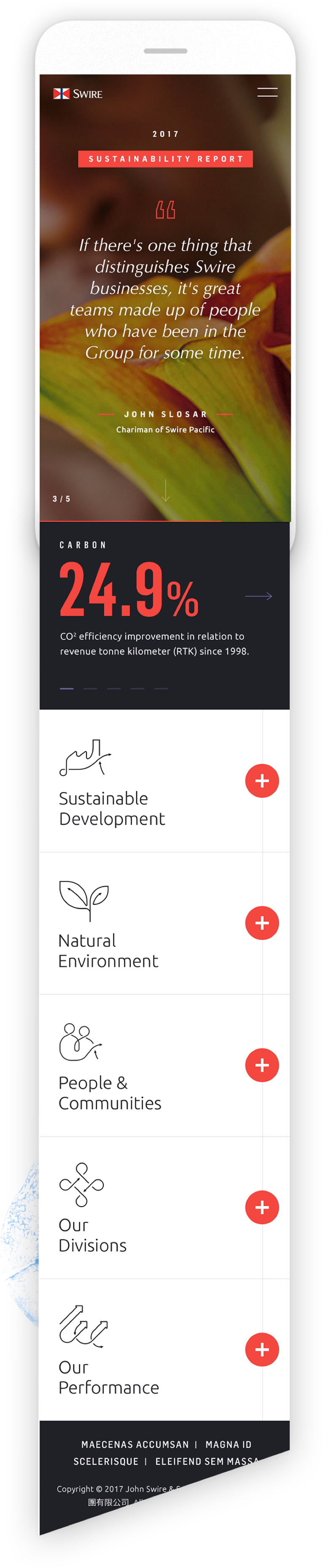
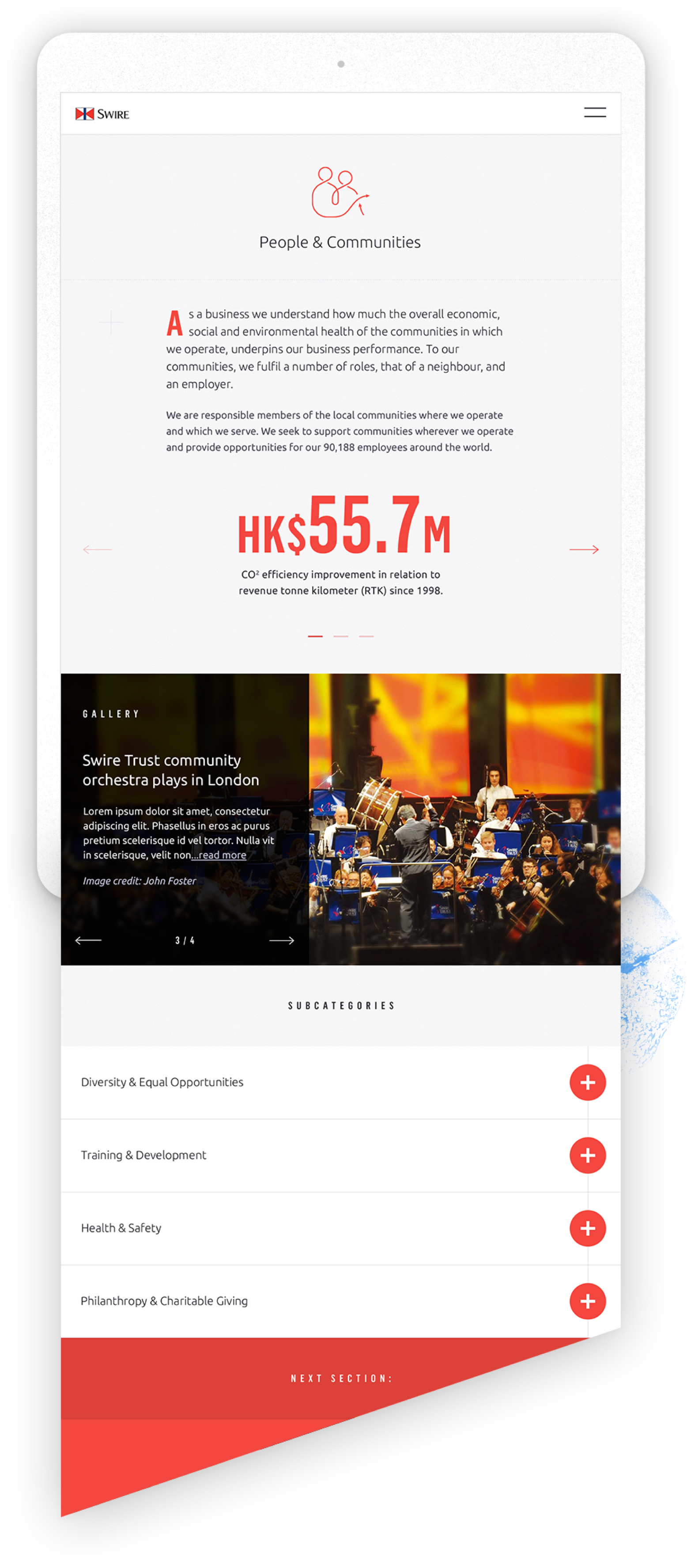
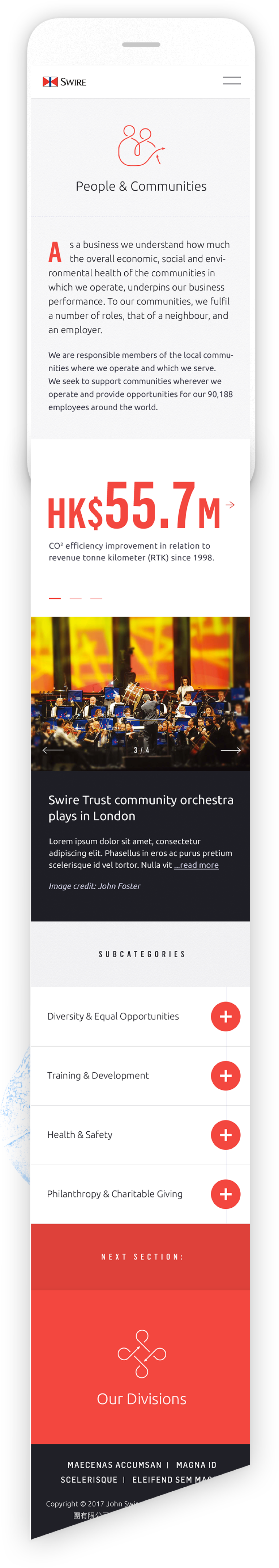
Homepage Tablet & Mobile
Mobile sizing
The project was on a very tight deadline for both myself and the developer team in Hong Kong and so I standardised mobile typography to keep things simple and avoid inconsistencies down the line. Facts became simple carousels.
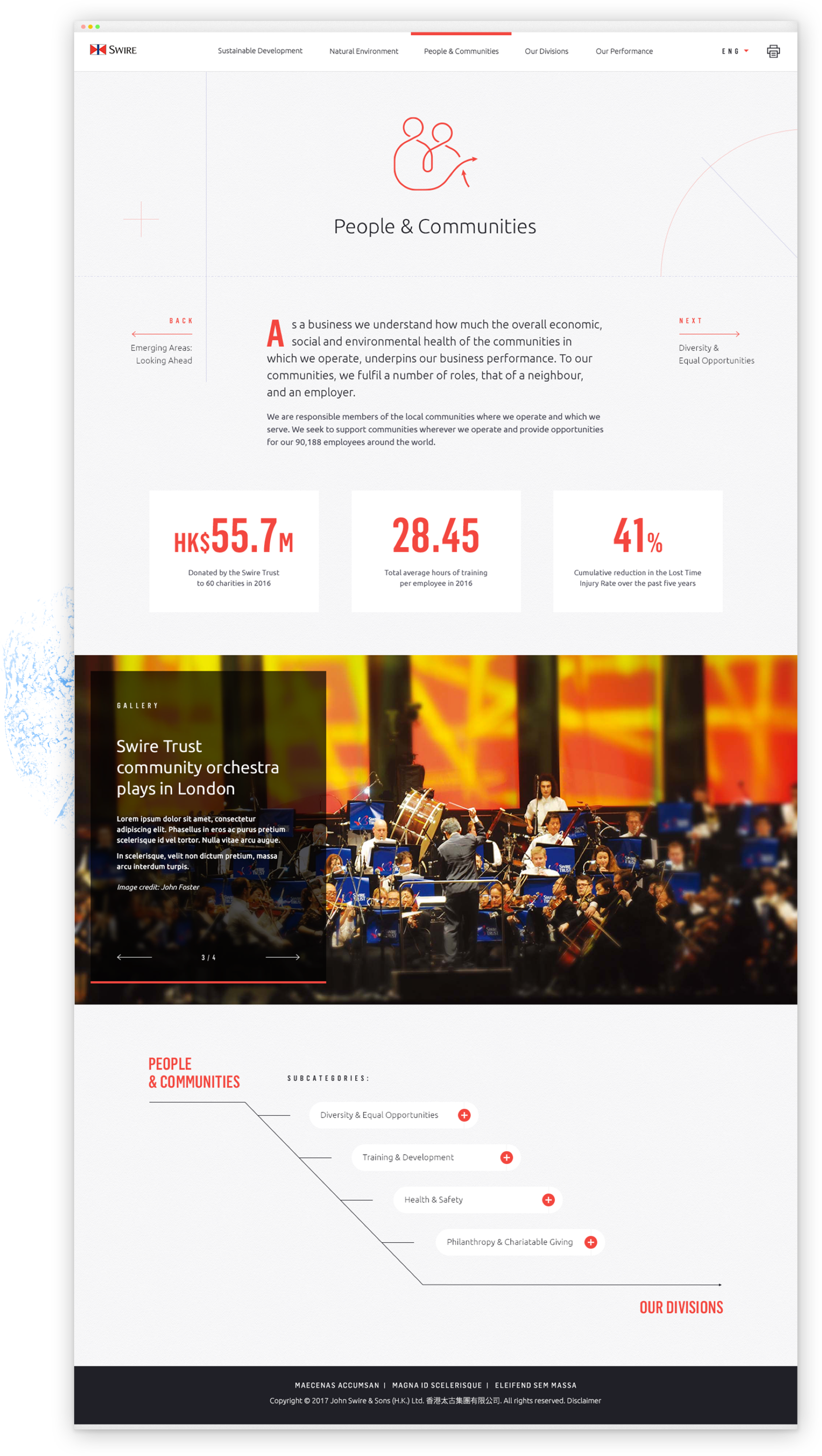
Section Header Page
Desktop
Dividing the site into just a few simple templates, I was able to keep timing and costs down for the project – this one being a main section page. Subsection pages followed a similar format, though the titling followed a left align structure and the emphasis on the iconography was not as prominent. Using the idea that we are continually moving forward throughout the report I’ve included a double navigation at the bottom of each section to make it easy to continue the reading journey.
Section Header Tablet & Mobile
Mobile sizing
Similar to the format of the desktop, I have slightly rejigged content to make it more tactile for mobile users.
Alternative Concept
Making the digital transition
Though the client was really keen on creating a more standardised ‘website’ format (in terms of the top navigation), I really wanted show something different, trying to blur the lines between the printed form of booklet and the digital platform we were now working on. Making sure as to not lose or confuse users, I developed a sort of continuous reader format where one section leads into the next, which aimed to tackle the ‘moving forward’ idea that was discussed in the beginning stages of the project. This first frame illustrates using abstract shapes based around the Swire logo to transition into the landing state.
Bold colour
Continuing on the theme of using strong colour blocks, data could drive these to provide some strong visual support.
Here and in the final shot we can see the sidebar providing users with some navigational support, avoiding the feeling of 'being lost,’ common with infinite scrollers.
