Agency: The BIO Agency
Art Direction: Nina Wei
For the first release, Arrow were very keen to highlight all the areas of the site, and show what they were about right from the Homepage. To present these new sections in a clear and concise way, whilst still maintaining Arrow’s purpose to sell products, was a challenge. Due to the quantity of technical information the page could become extremely busy, however using light and dark areas I was able to allocate sections and break up the content.
Desktop
Bespoke open hero
The Homepage hero area needed to hold its own among the other landing pages, therefore we devised a more open style for this section. This was cut for MVP.
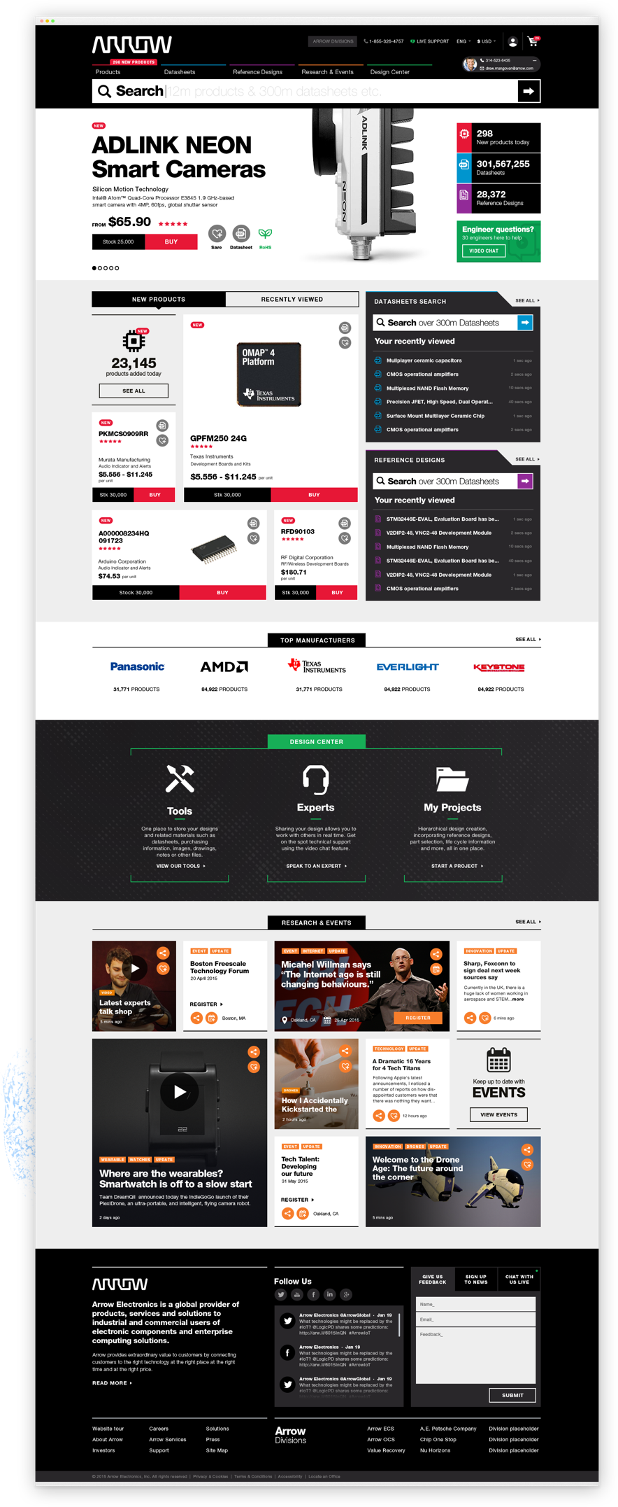
Datasheets & Reference Designs modules
In more technical areas of Arrow.com, engineers usually know what they are looking for or wish to return to something they have already found. Using the blue and purple section highlighters we wanted to allow users to get where they wanted to be at a single click.
Design Center
A new section for Arrow, we really wanted to create some interest around the Design Center and make it feel like a technical environment for experts to explore and utilise.
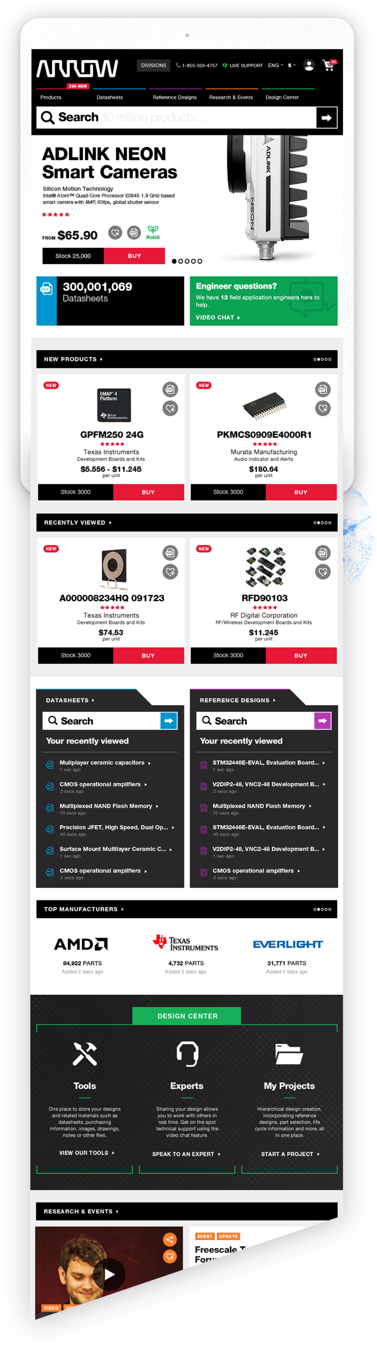
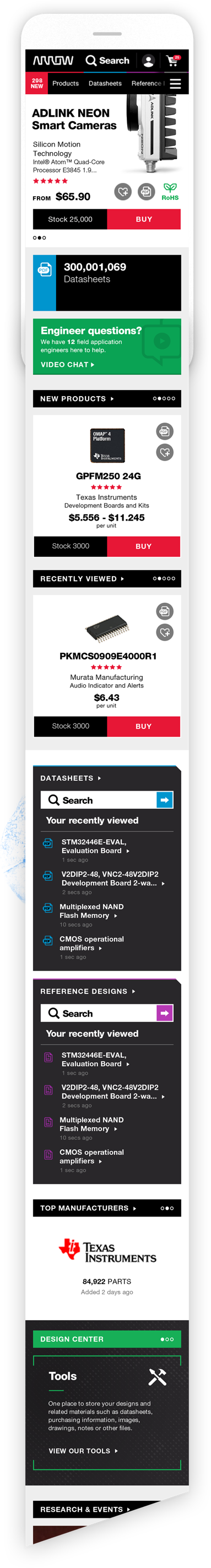
Tablet & Mobile
Collapsing content
For the mobile and tablet views, I really focussed on condensing down the information, hiding where possible, so that the user can scroll through this page and maintain a sense of location.